Pocket Pitch
Overview
95%+ of singers have relative pitch and cannot identify notes without a reference tool. Pocket Pitch solves this problem as a mobile app.
My Involvement
I founded and designed this app since 2015, collaborated with freelance developers through 2023, worked with a music producer for audio, and now develop updates using AI.
Impact
Monthly Active Users: 40,000+
Average Rating: 4.6 Stars
Total Reviews: 1,900+
#1 result for Pitch Pipe on App Store
Users
The largest demographic of users are non-professional singers who are performing or practicing fairly regularly. For example, this could mean members of a church or school choir. Additionally there are also other musicians and singers who just want a handy tool for personal use.
Key Features
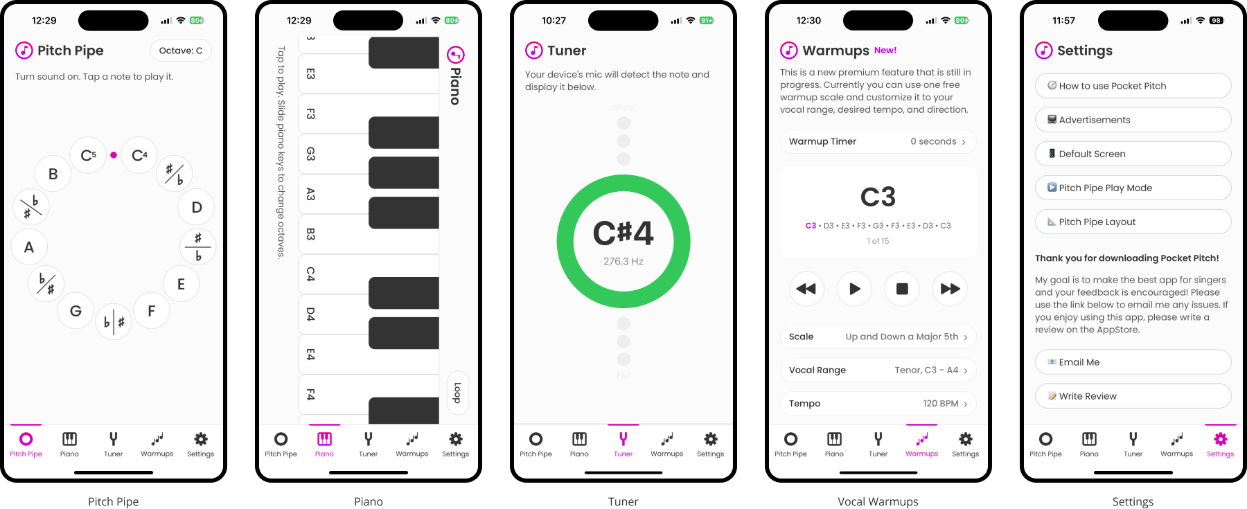
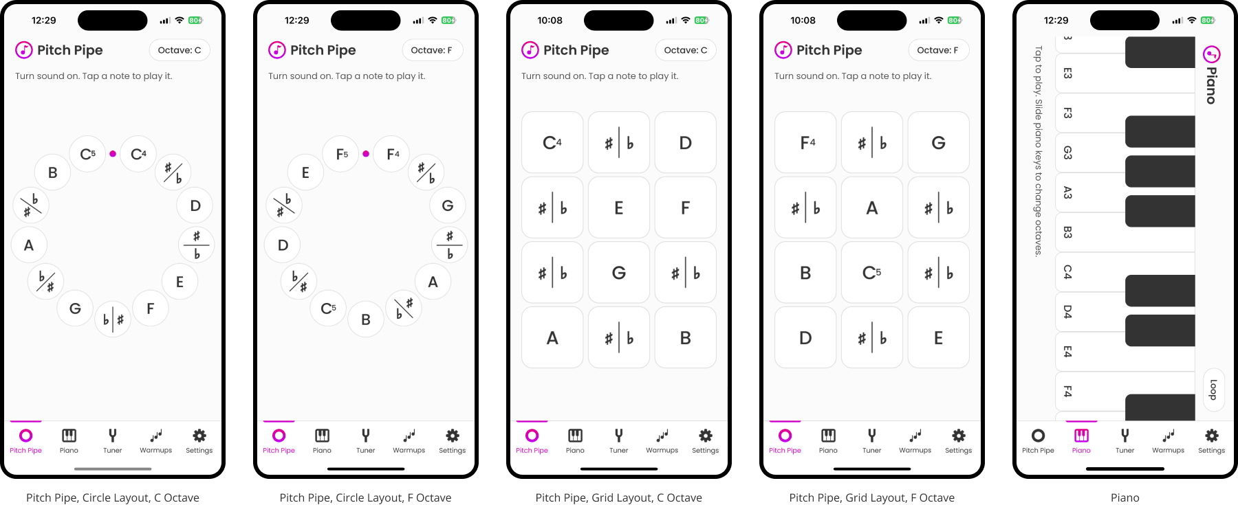
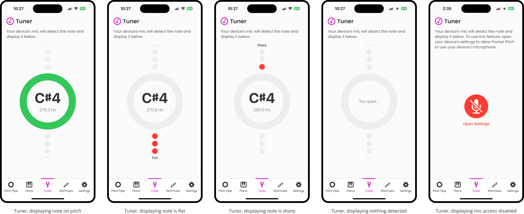
The pitch pipe, piano, and tuner are the key features of Pocket Pitch, and they were added to the app in that order. Each additional feature or feature's settings were added over time based on user feedback collected via email or public reviews.
Goal
The goal of Pocket Pitch is to offer these basic tools to singers for free, and make their practicing and performances easier and more successful. Revenue is generated via Ads and in-app purchases.
Premium Offerings
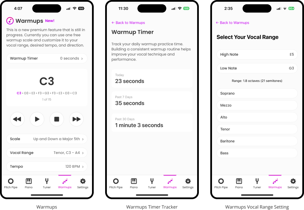
As of late 2025, I am adding Vocal Warmups as a premium feature that will be offered as part of a in-app subscription. This will not only include custom Vocal Warmups, but also the ability for users to track how much time they are spending warming up and practicing each day, week, month.
An introductory free version of this feature is currently available for users to try.
Fun Milestones
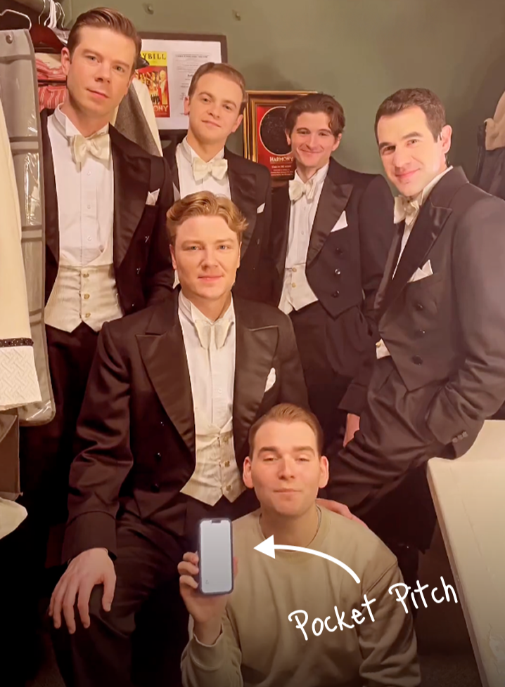
I founded this app in 2015 while working as a singer (pictured as Santa Claus) and then in 2024 Pocket Pitch became the official app of a Broadway Show (pictured still from social media post). A very cool full circle moment for myself!

